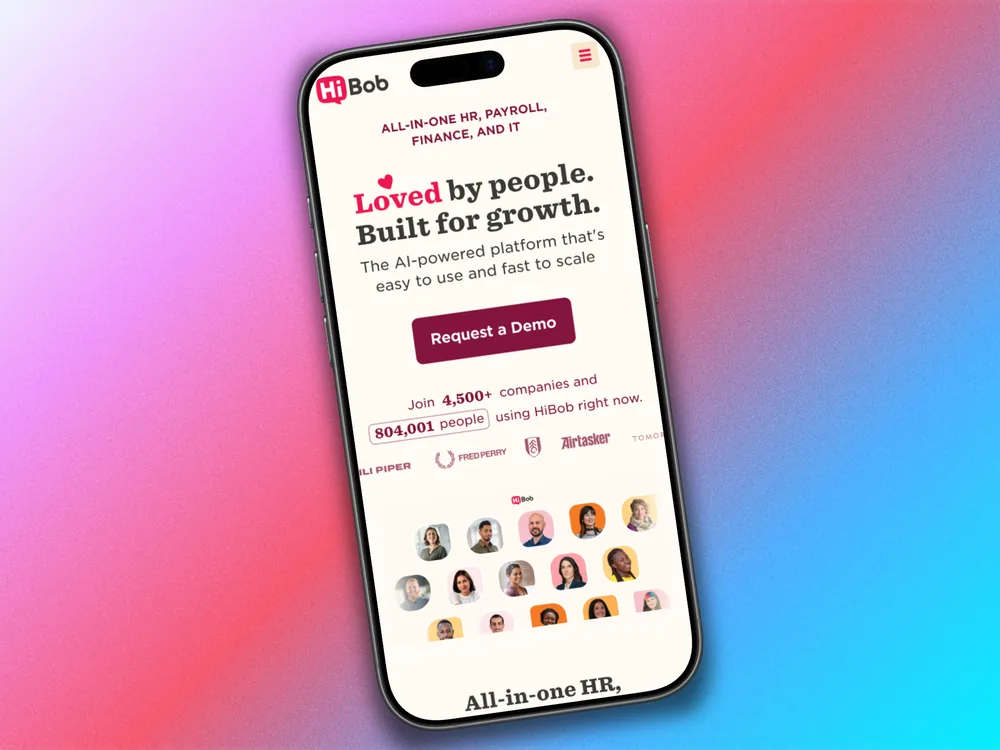
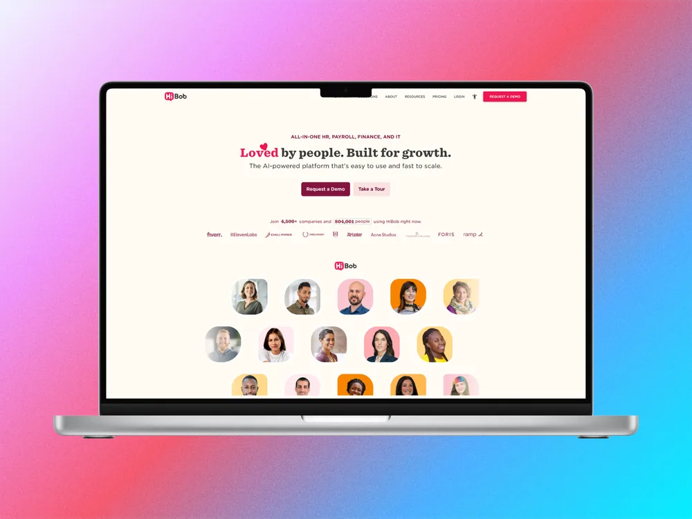
HiBobWebsite redesign 2026

Marketing pages & flows
Surfaces I designed across the redesigned HiBob marketing site.

HiBob · Design System

The HiBob website runs on a full design system — logo usage, colour tones, typography, forms, shapes, and reusable components — all documented in a shared style guide. My role was to design within this system and translate it into specs the dev team could build from confidently.

Typography
Typography

Typography

A pairing of Gotham SSm for body copy and a display serif for editorial headings. The system defines a full type scale across desktop and mobile.

Colours & Patterns
Colours & Patterns

Colours & Patterns

Cherry red paired with warm neutrals, dark wines, and accent yellows — every tone with a defined role across text, backgrounds, and UI states.

Forms & Components
Forms & Components

Forms & Components

Forms, inputs, buttons, modals, and date pickers all built out with every state documented — handoff was fast and the dev team could build with confidence.

Logo & Brand
Logo & Brand

Logo & Brand

Logo usage, lockups, and customer-logo treatments — keeping the brand consistent across every marketing surface.