The MontoPay website did not effectively communicate the complexity of B2B payment solutions in a straightforward manner. Users found it difficult to understand the unique features and benefits of the platform due to the overwhelming amount of information presented without a clear hierarchy.
To create a website that simplifies complex payment processes while clearly articulating MontoPay's value proposition. The design should engage users by presenting information in a digestible format, and build trust through a professional aesthetic and user-friendly interface.
Increase partner and investor engagement by developing a website that clearly communicates MontoPay's value proposition, encourages partnerships, and attracts investment. Improve security perception by emphasising the platform's security measures to build trust with users. Improve user experience and ensure a smooth journey through every page.
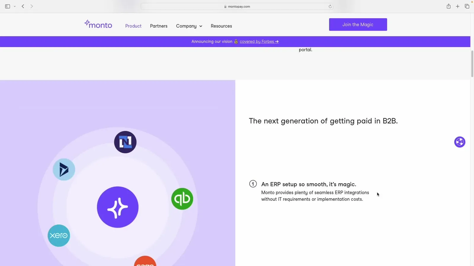
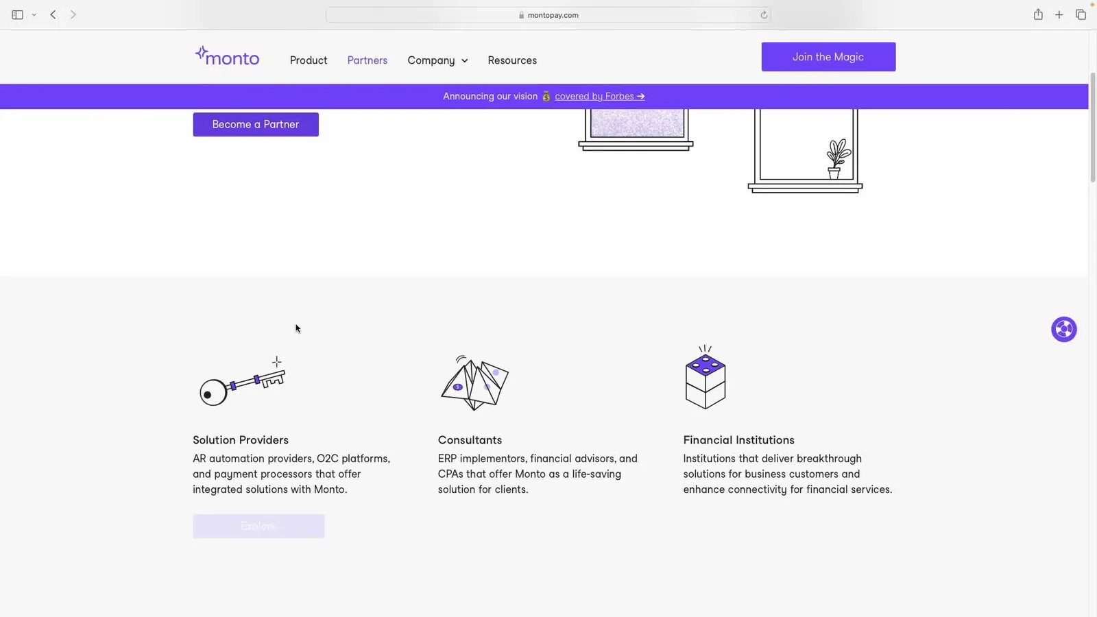
MontoPay's website revamp focused on communicating security, trust, and innovation in B2B payments. By defining key user personas — partners, investors, and end users — we tailored content and design to each audience. A refined content strategy highlighted security, innovation, and partnerships, while hand-drawn vector illustrations balanced professionalism with approachability. Lottie animations enhanced engagement, guiding users through complex information seamlessly.
I created a new visual identity for MontoPay with a modern and friendly aesthetic to reflect the company's spirit. Custom vector illustrations were designed to engage users and make the platform's features more relatable and easier to understand.